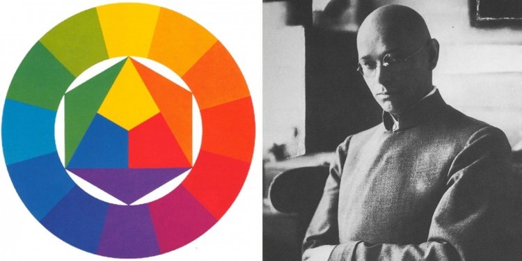

In 1961, the Swiss artist Johannes Itten created a specific palette of colors - the color wheel. He came up with this tool in order to help beginning painters to simplify their work with paints. Later on, this circle was slightly refined, and became a very effective table for color combination.
The scheme consists of 12 sectors, towards the center the shades become less saturated.
In the upper part - red and purple-red sectors, further clockwise - purple, blue-purple, blue, blue-green, green,
green-yellow, yellow, yellow-orange, orange and orange-red.
The main rule of using the scheme: as the main and
complementary shades, it is better to use the shades of one circle - inner, outer or some kind of middle. The accent
color can be darker and more saturated than the main and complementary ones.
Now let's take a look at
6 WAYS TO COMBINE COLORS ACCORDING TO ITTEN'S WHEEL
These combinations will greatly help you when creating a harmonious look both in clothing and jewelry.
By the way, there is a whole art of "correct" color mixing - the science of color theory.
Method N 1.
Complimentary combination
This is the simplest option - you need to take two opposite colors: red and green, purple and yellow, blue-green and red-orange.
The more saturated hues you use, the brighter and livelier the look is.

Method N 2..
Analogous combination
For a harmonious look, you can take from 2 to 5 colors which are next to each other. At the same time, it is very difficult to compose a look of five colors in such a way that the accents are placed correctly. But from three neighboring colors, you can easily make a winning ensemble.

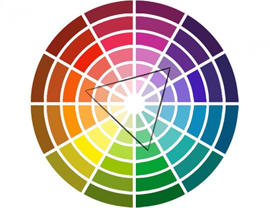
Method N 3. Triangle
If you need a contrasting and at the same time a logical look, then you can use three colors at once, which are equidistant from each other on the Itten's wheel. Two colors should be main colors and the third one should be accent color.

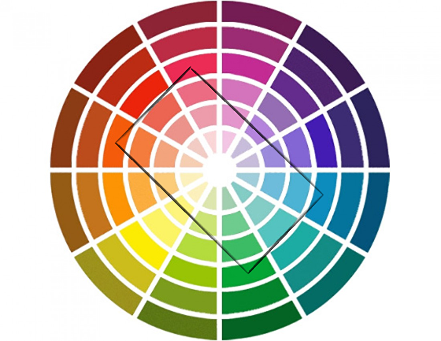
Method N 4. Square
This is another way of using equidistant colors in clothing. You need to take one color as the main, two colors as complementary, and one - as an accent. This kind of combination is more suitable for an interesting informal look.
Method N 5. Rectangle
Choose a base color. Two colors that are located in one and three sectors from it, will be used as complementary colors, and the opposite color will be used as an accent. This is a less contrasting combination than a square, but it is also very bright.

Method N 6..
Split-complimentary combination
A very harmonious color combination that looks more balanced than a simple complementary combination. The main color is selected, and the colors next to the opposites are used as complementary.
Only different colors are represented in Itten's wheel, so it's worth telling separately how to combine them with basic colors:
🤍 White goes well with any color.
🖤 If gray is the main color, then it is better to match it with accent colors of red, blue or purple.
Pink and fuchsia go well with gray.
🖤 Universal black can fit into any look, but it is best combined with pink, orange, yellow, red.
Combinations with light lilac, light green and white are also good. In the latter case, additional accents may be needed.
💛 Emerald, red and blue are most suitable for beige.
🤎 Combine brown with green, cream, deep blue, pink.
Basic colors never cause imbalance, and at the same time make the look less stressful